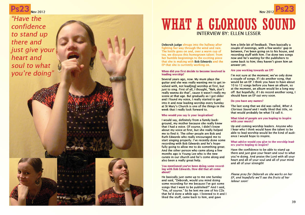
I apologise for the chaos of the ordering of this blog; I posted work after it was marked, and this means that it was posted after diary posts about other pieces of work. The work is also not necessarily in the order that it was mentioned on the brief. Therefore, I created this post so as to allow for easy access to all of the coursework in the order that it is mentioned on the brief.
Task 1: Production Schedule
Task 2: Case Studies
Task 3: Preliminary Task
Task 4: Preliminary Task Evaluation
Task 5: Newsstand Analysis and Magazine Distribution Methods
Task 6: House Styles and House Styles Pitch (including Task 7: Audience Feedback) and House Styles Redraft
Task 8: Photography
Task 9: Construction (final magazine)
First Draft
Second Draft
Final Draft
Task 10: Audience Research/Feedback (Main Task)
Questions used for Task 10:
Question 1
Question 2
Question 3
Question 4
Question 5
Task 11: Evaluation
Question 1
Question 2
Question 3
Question 4
Question 5
Question 6
Question 7
Ellen's Blog
My name is Ellen Lesser, and this is my Media blog. I will be blogging throughout my Media AS coursework.
Wednesday, 20 March 2013
Tuesday, 19 March 2013
Contents Page
- Added the new photos (of Pardon Received, the Editor, and the reviewer)
- Changed the layout slightly so that it looked more chaotic and random, more like Q's contents page, which would suit my younger audience more
Monday, 18 March 2013
Photography
Today I took three more photos for my contents page: one to complement the article about an upcoming artist, Pardon Received; one of the editor of my magazine and one of the music reviewer. The latter two will be cropped and resized on InDesign after they have been placed on my contents page.
Front Cover and Contents Page
Front Cover:
Contents Page:
- I was finding it difficult to find a photo to take to complement the Psalm 63 article on my contents page, therefore I changed the Psalm reading from Psalm 63 to Psalm 36, which mentions fountains, so I could take a photo of a fountain to complement the article on my contents page (see previous post); therefore, I needed to change the coverline on my front cover from 'Psalm 63' to 'Psalm 36'
Contents Page:
- I have added the features articles and replaced the article descriptions onto the contents page, within the new layout
- The picture of Yasmin has been changed; for my second draft I cropped the original photograph, yet for the new layout I used the original photograph (still cropped, but not as much) so that it fit better with the new layout
- I also put the feature article names in bold, so that the reader would know which articles were which
- Changed the font of the page numbers to the same font as the main text (Lucida Sans) so that there was continuity
- Added the photograph for the Psalm reading
- Changed the layout slightly of the regulars column so that the text and images fit better with the new layout
Sunday, 17 March 2013
Photography
Today, I took two new photos for my contents page. One to complement the Hymns vs. CCM article, and one to complement the Psalm reading.
Friday, 15 March 2013
Contents Page
- Cover story photo enlarged so that it fits in more with the new layout; I had to edit the brightness and contrast again as I put in the original version of the photo, and I had only edited the brightness and contrast on the cropped image before, therefore it looks slightly different to the photo in my second draft
- The description of the cover story has been changed so that it fits in better with the new layout and it is more like what would appear in a magazine
- The format of the page numbers has been changed so that they stand out more
- The new regulars column has words incorporated on pictures like in Q, which makes it more conventional and appeals to my younger audience (the Pardon Received photo will be taken at a later date)
- Some of the section titles were not fitting in with the guidelines, so I resized them slightly
- The reviews section has been changed, and the names of the general articles are now in bold so that they stand out more (the photo of the reviewer will be taken at a later date)
Subscribe to:
Comments (Atom)


