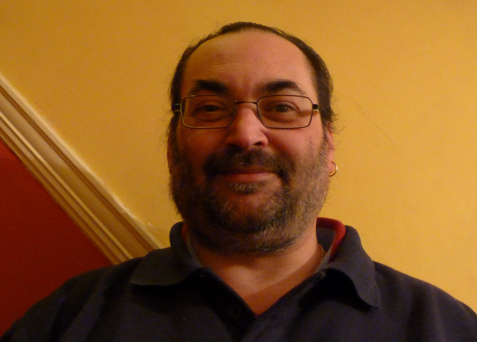
- Added the new photos (of Pardon Received, the Editor, and the reviewer)
- Changed the layout slightly so that it looked more chaotic and random, more like Q's contents page, which would suit my younger audience more
My name is Ellen Lesser, and this is my Media blog. I will be blogging throughout my Media AS coursework.
Showing posts with label Diary Posts. Show all posts
Tuesday, 19 March 2013
Contents Page
Monday, 18 March 2013
Photography
Today I took three more photos for my contents page: one to complement the article about an upcoming artist, Pardon Received; one of the editor of my magazine and one of the music reviewer. The latter two will be cropped and resized on InDesign after they have been placed on my contents page.
Front Cover and Contents Page
Front Cover:
Contents Page:
- I was finding it difficult to find a photo to take to complement the Psalm 63 article on my contents page, therefore I changed the Psalm reading from Psalm 63 to Psalm 36, which mentions fountains, so I could take a photo of a fountain to complement the article on my contents page (see previous post); therefore, I needed to change the coverline on my front cover from 'Psalm 63' to 'Psalm 36'
Contents Page:
- I have added the features articles and replaced the article descriptions onto the contents page, within the new layout
- The picture of Yasmin has been changed; for my second draft I cropped the original photograph, yet for the new layout I used the original photograph (still cropped, but not as much) so that it fit better with the new layout
- I also put the feature article names in bold, so that the reader would know which articles were which
- Changed the font of the page numbers to the same font as the main text (Lucida Sans) so that there was continuity
- Added the photograph for the Psalm reading
- Changed the layout slightly of the regulars column so that the text and images fit better with the new layout
Sunday, 17 March 2013
Photography
Today, I took two new photos for my contents page. One to complement the Hymns vs. CCM article, and one to complement the Psalm reading.
Friday, 15 March 2013
Contents Page
- Cover story photo enlarged so that it fits in more with the new layout; I had to edit the brightness and contrast again as I put in the original version of the photo, and I had only edited the brightness and contrast on the cropped image before, therefore it looks slightly different to the photo in my second draft
- The description of the cover story has been changed so that it fits in better with the new layout and it is more like what would appear in a magazine
- The format of the page numbers has been changed so that they stand out more
- The new regulars column has words incorporated on pictures like in Q, which makes it more conventional and appeals to my younger audience (the Pardon Received photo will be taken at a later date)
- Some of the section titles were not fitting in with the guidelines, so I resized them slightly
- The reviews section has been changed, and the names of the general articles are now in bold so that they stand out more (the photo of the reviewer will be taken at a later date)
Wednesday, 13 March 2013
DPS and Contents Page
DPS
The main problem with my Contents Page was its layout, therefore I have drafted a new layout on Microsoft PowerPoint that is similar to that of Q, which should make my Contents Page more appropriate for my target age.
- Made the margin smaller between the columns; this makes it look more professional
- Put the introduction of the article in the same text box as the first column of the Q&A, which makes it easier to manipulate the article as a whole
- Made the masthead smaller so that it does not look too big and distract the reader
- Moved the date from the top of the masthead to the bottom as before it looked as though it was floating in space
- Changed the size of the gaps between the answer of a question and the next question; this makes it more professional and highlights the different questions as they look like they are in different paragraphs more than they did before
- Changed the font of the by-line to the main text font, as this makes the headline stand out more, and makes it unique
- Made the masthead the same size as it is on the DPS to show continuity and so as not to distract the reader
- Moved the date of the issue to the bottom of the masthead to match the DPS
- Changed the layout to suit the new layout that I have planned for the contents page (see below)
- Changed the colour scheme to match the new one on the front cover and the DPS
- Changed the font to match the new font on the front cover and the DPS
- Changed the Editor's Letter so it fits more easily within the space
- Added room for a photo of the editor to make the magazine more like Christian Musician, which had a photo of the editor (this will also broaden the range of models used in my magazine)
The main problem with my Contents Page was its layout, therefore I have drafted a new layout on Microsoft PowerPoint that is similar to that of Q, which should make my Contents Page more appropriate for my target age.
Tuesday, 12 March 2013
Front Cover and DPS
Front cover:
- Changed the format of the Big Church Night In coverline to the same format as the white skylines, in regards to the drop shadow
- Added a rectangle behind the skyline with a gradient so that they are more visible, like on Worship Musician and Christian Musician
- Moved the masthead down so it isn't too close to the new rectangle as two such similar colours that close to one another would not look aesthetically pleasing
- Moved the skylines up and made sure that they are better aligned with each other
DPS:
- Changed the colour of the text so that it matches the new colour scheme from the masthead
- Changed the font to match the front cover (Lucida Sans)
- Changed the masthead in the corner to the new masthead with the new colour scheme
Monday, 11 March 2013
Front Cover
In my free lesson, I have been working on my front cover. I have made the following changes to my front cover:
- Changed the colour scheme of the masthead to colours that contrast the background rather than complement it so that it stands out more
- Changed the colour scheme of the coverlines to go with the new masthead
- Changed font to Lucida Sans, which is a similar font to the one used in Worship Musician and Christian Musician and therefore is more conventional and stands out more
- Added an outer glow to the coverlines in the opposite masthead colour to the main text colour so that it stands out; this is also done in Worship Musician
- Changed the inner shadow on the coverline description to the other masthead colour so that it stands out more
- The skylines have been moved so that they have a better alignment on the page, and have been moved up so they don't overlap with the masthead
Friday, 11 January 2013
Updating Blog
Yesterday and today I have had lessons, and I have been working on my blog. This included changing the labels and making sure that the entries have been detailed enough.
Changing the labels
During the process of this blog, I have labelled all of my entries on this blog with the following labels:
Changing the labels
During the process of this blog, I have labelled all of my entries on this blog with the following labels:
- Contents Page
- Coursework
- Diary Post
- DPS
- Front Cover
- Evaluation
- Induction Task
- Construction
- Coursework
- Diary Posts
- Evaluation
- Induction Task
- Preliminary Task
- Research and Planning
Wednesday, 9 January 2013
Updating Production Schedule
I had a lesson today so I have been updating my production schedule. However, it has proved troublesome in the past to update my production schedule directly on my blog. Therefore, I used a blank template of my production schedule on Word (which would also allow me to add extra weeks to it) and copy-and-pasted all of the current entries on my production schedule into the Word version.
Therefore, I could easily update my production schedule and simply delete the table that I already had on my production schedule post, and replace it with the new, updated table.
Monday, 31 December 2012
Planning Evaluation
Ever since I last blogged, I have been working on my evaluation. This includes:
- Planning the answers to each question
- Choosing an appropriate technology to present the answer to each question
- Preparing the presentation of each question
- Question 2 (podcast)
- Question 3 (vlog)
- Question 4 (vlog)
- Question 5 (Prezi)
- Question 6 (Prezi)
Friday, 7 December 2012
Front Cover, Contents Page and DPS
I had a lesson yesterday, and so was working on all the parts of my magazine.
Front Cover
As the Big Church Night In coverline had the less important words, 'Your guide to,' on a separate line to the rest of the coverline, I decided to do the same with the Olympic Effect coverline, and put the less important word, 'the', on the line above. This made the coverline shorter and meant that it didn't obscure more of the model.
I also changed the colour of the Big Church Night In coverline from black to white, as white is now a part of my colour scheme and the coverline was not as easily legible when it was black.
Contents Page
The only thing that I changed on my contents page was the image of my cover model. As I had changed the brightness and contrast of the main image on my DPS, which was taken in the same photo shoot, I decided to do this with all of the images from that photo shoot. The effect that this had on the image was to make it brighter so that it was clearer and more conventional, as it is unlikely that a darker photo will be used in a magazine.
DPS
I also changed the brightness and contrast of the smaller images on my DPS, and added an exclamation mark on the last sentence of the interview. Before, this sentence finished with a full stop, but now that it finishes with an exclamation mark, it has a greater tone of enthusiasm.
Front Cover
As the Big Church Night In coverline had the less important words, 'Your guide to,' on a separate line to the rest of the coverline, I decided to do the same with the Olympic Effect coverline, and put the less important word, 'the', on the line above. This made the coverline shorter and meant that it didn't obscure more of the model.
I also changed the colour of the Big Church Night In coverline from black to white, as white is now a part of my colour scheme and the coverline was not as easily legible when it was black.
Contents Page
The only thing that I changed on my contents page was the image of my cover model. As I had changed the brightness and contrast of the main image on my DPS, which was taken in the same photo shoot, I decided to do this with all of the images from that photo shoot. The effect that this had on the image was to make it brighter so that it was clearer and more conventional, as it is unlikely that a darker photo will be used in a magazine.
DPS
I also changed the brightness and contrast of the smaller images on my DPS, and added an exclamation mark on the last sentence of the interview. Before, this sentence finished with a full stop, but now that it finishes with an exclamation mark, it has a greater tone of enthusiasm.
Thursday, 6 December 2012
Workshop
I had a Media workshop during which I made lots of alterations to my magazine and learnt lots about Photoshop and InDesign. In this post I will be explaining what I learnt from this workshop about Photoshop and InDesign.
Front Cover
Contents Page
DPS
What I learnt
Photoshop
Front Cover
Contents Page
DPS
What I learnt
Photoshop
- How to use the eyedropper tool
- How to give text an inner glow
- How to use the quick selection tool
- How to use the magic wand tool
- How to use the magic wand tool and then create a new layer with the selected element
- How to change the opacity of a layer
- How to edit the elements of a drop shadow e.g. colour, distance from text, etc.
- How to use the paint bucket tool
- How to edit the brightness and contrast of images
- How the crop tool works
- How to make text bold
- How to change the view on Photoshop so that the guidelines are not visible, therefore getting a preview of what the exported JPEG will look like
- How to use the rectangle tool
- How to use the gradient feather tool and change the level of tint of the gradient
Tuesday, 4 December 2012
Audience Feedback
I have received audience feedback on the first draft of my magazine via my blog, and am having a Media workshop on Wednesday to act on the feedback that I have been given. I have, therefore, made a plan for action to make changes to my magazine based on the feedback at the workshop.
Feedback
Front Cover
Contents Page
DPS
The main image is slightly dark, so I will try and play around with some effects to edit this image and see if I can make it look better.
I don't agree with the comment that the model's expression seems forced. This is because when I was doing my photo shoot (Location Shoot 3), I simply asked the model to choose her own poses, and when she did one that I liked, I asked her to keep it while I took a few photos of her in that pose. Therefore, because the model chose her own poses, I don't think that they were forced.
As for the comment that the background is bland, this was something that I had thought was a problem with my contents page, not my DPS, as there is more white background visible on my contents page.
Plan for action
Front Cover
Feedback
Front Cover
- The fact that the name of my magazine is a Psalm is good
- My front cover needs a better layout
- The image needs to be changed
Contents Page
- The colour scheme from the front cover continues
- The contents are positioned effectively and clearly
- There is not too much space filled in
- Despite the above, it is still eye-catching
- The contents page is overloaded with information
- It is a little confusing as there is a lot of text
DPS
- There are two small images in the corner, and it would be better if there was another one as there is a space at the end without an image in it
- There is a good use of colour on the article (mentioned by two people)
- The headline that I have used is good
- The questions asked are good and make the magazine look more professional
- I should play around with some effects on the big image so that it is clearer
- There should be more colours in the background, as it is rather bland
- The model's expression in the smaller pictures seems forced
The main image is slightly dark, so I will try and play around with some effects to edit this image and see if I can make it look better.
I don't agree with the comment that the model's expression seems forced. This is because when I was doing my photo shoot (Location Shoot 3), I simply asked the model to choose her own poses, and when she did one that I liked, I asked her to keep it while I took a few photos of her in that pose. Therefore, because the model chose her own poses, I don't think that they were forced.
As for the comment that the background is bland, this was something that I had thought was a problem with my contents page, not my DPS, as there is more white background visible on my contents page.
Plan for action
Front Cover
- Change the image
- Edit the layout
- Make article descriptions shorter
- Try some effects with the background
- Try some effects on the big image
- Move one of the images to the opposite corner
Alterations
When I spoke to my model, I discovered that she decided to use the name that I picked out for her (Deborah Judge) instead of her real name. Therefore, I changed this on my front cover, my contents page, and my DPS.
Front Cover Experiments (Part 2)
My audience feedback told me that I should change the main image on my front cover. I therefore took some more photos and have selected the five best ones. I have chosen to make front covers of all of these, with the same layout that my original front cover had. This is just to see which photo works best as a front cover. I will be changing the layout at a later date.
Front Cover Option 1:
Front Cover Option 2:
Front Cover Option 3:
Front Cover Option 4:
Front Cover Option 5:
I think that the best photo out of these is the third option. This is because she looks dynamic and the masthead fits well with the photo. Also, the lighting does not obscure her face by being too bright, and is not too dark to look unprofessional. However, my target audience may think differently, so I will be asking them which they think is the best before making a decision.
Front Cover Option 1:
Front Cover Option 2:
Front Cover Option 3:
Front Cover Option 4:
Front Cover Option 5:
I think that the best photo out of these is the third option. This is because she looks dynamic and the masthead fits well with the photo. Also, the lighting does not obscure her face by being too bright, and is not too dark to look unprofessional. However, my target audience may think differently, so I will be asking them which they think is the best before making a decision.
Friday, 30 November 2012
Contents Page and Exporting from InDesign
I had a lesson today, so have been working on my contents page and finishing off the final touches.
I changed the size of the pictures for other articles (not for my cover story) so that they are clearer. I was also concerned with the fact that there seemed to be a lot of gaps on the contents page, and so made them bigger to fill these gaps in more.
I also moved the Regulars title for this reason; there was a big gap to the right of this title, so I moved it to fill this gap.
Another thing that I had been concerned with about all of my InDesign documents was that they were on spreads over two A4 pages, not just A3 page that was cut in half. Therefore, whenever I exported it to JPEG, the two pages were exported separately, which meant that I would have to stick them together after exporting them.
However, after looking on the Adobe discussion boards and asking my teacher, I found out how to export a double page spread (DPS) as a single JPEG from InDesign:
I changed the size of the pictures for other articles (not for my cover story) so that they are clearer. I was also concerned with the fact that there seemed to be a lot of gaps on the contents page, and so made them bigger to fill these gaps in more.
I also moved the Regulars title for this reason; there was a big gap to the right of this title, so I moved it to fill this gap.
Another thing that I had been concerned with about all of my InDesign documents was that they were on spreads over two A4 pages, not just A3 page that was cut in half. Therefore, whenever I exported it to JPEG, the two pages were exported separately, which meant that I would have to stick them together after exporting them.
However, after looking on the Adobe discussion boards and asking my teacher, I found out how to export a double page spread (DPS) as a single JPEG from InDesign:
- When exporting, select the Range option
- Then select the spread option
Thursday, 29 November 2012
Front Cover, Contents Page and DPS
I had a lesson today, so was working on all the parts of my magazine.
Front Cover
As one of the issues that my teacher had with my front cover was my image, I took another photograph where my model was smiling. Another problem was the background at the far right had too much going on; it had stairs and other things in it that made the photograph look bad.
Therefore, I took a photo that I had originally dismissed because it had too much tree above the model's head, and cropped it so that this was no longer an issue. I also uploaded it to Photoshop and used the Clone Tool to edit out the background and make it the same colour as the rest of the white light.
I then duplicated all of the coverline layers from one Photoshop document to another, so that I could see how this image would look with the coverlines without having to make the coverlines again.
However, this image is still not suitable, therefore I will have to take another front cover image to replace the one that I have been using.
Contents Page
On my contents page, I added gaps between the review descriptions at text size 5, as this is how the other descriptions have gaps between them. Therefore there is continuity throughout the contents page. This meant that I had to change the wording of some of the descriptions, as the gaps meant that less text could fit in the box that I had outlined for the descriptions to fit in. I also got rid of the ellipses at the end of these descriptions, as they made it look childish and therefore would not appeal to my target audience.
The final thing that I did on my contents page was change the page number on my photo for the Hymns vs. CCM article, as this was now on a different page after I made changes to my flat plan.
DPS
I changed the size of the text on my DPS, as it was smaller than the text on my contents page which took away from the continuity of the piece.
I also changed the size of the gap between the questions to text size 5, as I did on the contents page, so that there was still room for more text even though the text size was bigger.
The final thing that I did on my DPS was to edit the journalism and cut a few of the unnecessary sentences out so that the bigger text fitted better, as if these sentences had been kept in, the journalism would not have fitted in the space allotted.
Front Cover
As one of the issues that my teacher had with my front cover was my image, I took another photograph where my model was smiling. Another problem was the background at the far right had too much going on; it had stairs and other things in it that made the photograph look bad.
Therefore, I took a photo that I had originally dismissed because it had too much tree above the model's head, and cropped it so that this was no longer an issue. I also uploaded it to Photoshop and used the Clone Tool to edit out the background and make it the same colour as the rest of the white light.
I then duplicated all of the coverline layers from one Photoshop document to another, so that I could see how this image would look with the coverlines without having to make the coverlines again.
However, this image is still not suitable, therefore I will have to take another front cover image to replace the one that I have been using.
Contents Page
On my contents page, I added gaps between the review descriptions at text size 5, as this is how the other descriptions have gaps between them. Therefore there is continuity throughout the contents page. This meant that I had to change the wording of some of the descriptions, as the gaps meant that less text could fit in the box that I had outlined for the descriptions to fit in. I also got rid of the ellipses at the end of these descriptions, as they made it look childish and therefore would not appeal to my target audience.
The final thing that I did on my contents page was change the page number on my photo for the Hymns vs. CCM article, as this was now on a different page after I made changes to my flat plan.
DPS
I changed the size of the text on my DPS, as it was smaller than the text on my contents page which took away from the continuity of the piece.
I also changed the size of the gap between the questions to text size 5, as I did on the contents page, so that there was still room for more text even though the text size was bigger.
The final thing that I did on my DPS was to edit the journalism and cut a few of the unnecessary sentences out so that the bigger text fitted better, as if these sentences had been kept in, the journalism would not have fitted in the space allotted.
Wednesday, 28 November 2012
Front Cover, Flat Plan, Contents Page and DPS
I had a lesson today, so I have been working on all of the parts of my magazine. I have also made some changes to my flat plan, which have affected other parts of my magazine.
Front Cover
I only made one change to my front cover, and that was to change the name of the artist that is being interviewed at part of the regular features (each month there is a review of a new/unknown artist). After a quick Google search, I disovered that the artist that I had planned to name for this article (Soldiers of Christ) was already a band, therefore I couldn't use this name. Therefore, I have changed the name of the artist that is being interviewed from Soldiers of Christ to Pardon Received (which is a play on words of a line in the hymn To God Be The Glory). I Googled this name and found that it was not a real band already, and was therefore suitable for use.
Flat Plan
When I was looking at my contents page, I found that the length of some of the articles did not seem that realistic. Also, there were some articles that seemed rather close together, when in reality they would probably have an advert between them. Therefore, I made some changes to my flat plan in order to make a few of the articles longer and over more pages, and to move them around slightly so that they were broken up by adverts more.
I also added page numbers on my flat plan so it was easier to see the exact pages where articles began and ended and were adverts were.
Contents Page
The first thing that I did to my contents page was change the name of the artist interviewed from Soldiers of Christ to Pardon Received, to flow from the front cover.
I also changed the spaces between the titles (features, regulars, etc.) and the text boxes beneath them. This was because the gaps between them were different sizes, so I changed them so that they were as near to the same size as I could get them.
I changed the page numbers of the articles because of the flat plan. On my flat plan, I moved the Premier Radio Column to after the Worship Leader Advice column, therefore I had to change these around in the Regulars columns so that all the articles were still listed in chronological order.
The final thing that I did to my contents page was change the Reviews column, so that there is an album and a single of the month, and so that the text is more descriptive rather than just a list of albums and singles.
DPS
The only thing I did to my DPS was change the page number so that it fitted with the flat plan and the contents page.
Front Cover
I only made one change to my front cover, and that was to change the name of the artist that is being interviewed at part of the regular features (each month there is a review of a new/unknown artist). After a quick Google search, I disovered that the artist that I had planned to name for this article (Soldiers of Christ) was already a band, therefore I couldn't use this name. Therefore, I have changed the name of the artist that is being interviewed from Soldiers of Christ to Pardon Received (which is a play on words of a line in the hymn To God Be The Glory). I Googled this name and found that it was not a real band already, and was therefore suitable for use.
Flat Plan
When I was looking at my contents page, I found that the length of some of the articles did not seem that realistic. Also, there were some articles that seemed rather close together, when in reality they would probably have an advert between them. Therefore, I made some changes to my flat plan in order to make a few of the articles longer and over more pages, and to move them around slightly so that they were broken up by adverts more.
I also added page numbers on my flat plan so it was easier to see the exact pages where articles began and ended and were adverts were.
Contents Page
The first thing that I did to my contents page was change the name of the artist interviewed from Soldiers of Christ to Pardon Received, to flow from the front cover.
I also changed the spaces between the titles (features, regulars, etc.) and the text boxes beneath them. This was because the gaps between them were different sizes, so I changed them so that they were as near to the same size as I could get them.
I changed the page numbers of the articles because of the flat plan. On my flat plan, I moved the Premier Radio Column to after the Worship Leader Advice column, therefore I had to change these around in the Regulars columns so that all the articles were still listed in chronological order.
The final thing that I did to my contents page was change the Reviews column, so that there is an album and a single of the month, and so that the text is more descriptive rather than just a list of albums and singles.
DPS
The only thing I did to my DPS was change the page number so that it fitted with the flat plan and the contents page.
Monday, 26 November 2012
Front Cover, Contents Page, and DPS
I had a lesson today, so I have been working on all the parts of my magazine.
Front Cover
On my front cover, I changed the main coverline (pull-quote) to a different pull-quote from my interview. This was because the other pull-quote that I had been using was far too long, and it took up too much room to make the magazine look professional. Therefore, I chose a shorter quote and made the text slightly smaller, so that it fit better.
I also moved the main coverlines around slightly, so that they fit better with the stripes on my model's top.
Contents Page
On my contents page, I realised that the reviews all seemed to blend in together; it was not clear where one album/single name ended and where the next one began, as a few of the album names went over two lines. Therefore, I gave every other album/single name a black 'glow' at 20% (so that the glow did not blur the individual letters) which makes it easier to know where one album/single name ends and the next one begins.
Another thing that I did on my contents page was to edit my Editor's Letter slightly, as before, the cover story was mentioned in the same sentence as one of the other features, which took away importance from it. Therefore, I changed the wording and punctuation of my Editor's Letter so that the cover story was in a sentence on its own and became more important.
DPS
On my DPS, I changed the wording of the introduction so that it made more sense. I also added a few notes in brackets within the interview dialogue so that if the reader doesn't know who a person mentioned by the artist is, the text in the brackets will explain.
Another thing that I did on my DPS was add colour to some of the text. I changed the colour of the headline so that the colour flowed from the red in my model's dress and therefore made it different from the main colour scheme and unique to this DPS.
The colour of the questions has also been changed, so that the DPS is more colourful to appeal to my audience, rather than having purely black and white text. However, I set the colour tint at 70% so the colour was not as harsh.
The final change I made to my DPS was to add colour to my introduction. I made everything green apart from the names of people mentioned in my DPS. I did this for two reasons:
Front Cover
On my front cover, I changed the main coverline (pull-quote) to a different pull-quote from my interview. This was because the other pull-quote that I had been using was far too long, and it took up too much room to make the magazine look professional. Therefore, I chose a shorter quote and made the text slightly smaller, so that it fit better.
I also moved the main coverlines around slightly, so that they fit better with the stripes on my model's top.
Contents Page
On my contents page, I realised that the reviews all seemed to blend in together; it was not clear where one album/single name ended and where the next one began, as a few of the album names went over two lines. Therefore, I gave every other album/single name a black 'glow' at 20% (so that the glow did not blur the individual letters) which makes it easier to know where one album/single name ends and the next one begins.
Another thing that I did on my contents page was to edit my Editor's Letter slightly, as before, the cover story was mentioned in the same sentence as one of the other features, which took away importance from it. Therefore, I changed the wording and punctuation of my Editor's Letter so that the cover story was in a sentence on its own and became more important.
DPS
On my DPS, I changed the wording of the introduction so that it made more sense. I also added a few notes in brackets within the interview dialogue so that if the reader doesn't know who a person mentioned by the artist is, the text in the brackets will explain.
Another thing that I did on my DPS was add colour to some of the text. I changed the colour of the headline so that the colour flowed from the red in my model's dress and therefore made it different from the main colour scheme and unique to this DPS.
The colour of the questions has also been changed, so that the DPS is more colourful to appeal to my audience, rather than having purely black and white text. However, I set the colour tint at 70% so the colour was not as harsh.
The final change I made to my DPS was to add colour to my introduction. I made everything green apart from the names of people mentioned in my DPS. I did this for two reasons:
- So that there was more colour on my DPS
- So that even though there is colour, the names remain black and still stand out against the green of the rest of the introduction; this is something that I noticed NME did when I went back to have a look at my Case Studies for inspiration
Subscribe to:
Posts (Atom)