Saturday, 27 October 2012

Newsstand Task Part 2

The second part of the Newsstand Task was to research different magazine distribution methods, such as physical distribution, direct distribution, etc. This is my research:


Physical Distribution

Newsstands provide physical distribution, i.e. the magazine is physically on the newsstand and people can pick it up and buy it. Physical distribution is the movement of finished products from the manufacturer to the consumer. It involves going through various wholesaling and retailing channels, and included areas of customer service, transportation, and warehousing. Physical distribution works on a sale and return agreement between the retailer and the publisher. This means that if a retailer buys 20 magazines and only sells 16 of them, they can send back the four unsold magazines and the retailer is not charged for these magazines.

However, physical distribution is time consuming and expensive. As it involves the transport of products from the manufacturer and the consumer, it also involves all the costs of transport, such as petrol and drivers. Also, there will be the added costs of unsold magazines. Before they are made, it is impossible for publishers to know how well a magazine or issue of a magazine is going to sell. If retailers send back lots of magazines which cost the retailer nothing, the publisher is losing money on the unsold magazines. Therefore, physical distribution is an expensive method of distribution.

There are three types of physical distribution: intensive distribution, selective distribution, and exclusive distribution. For magazines, intensive distribution is used; this means that they are stocked the majority of retail outlets.

Direct Distribution

Direct distribution is when a free magazine is given directly to the consumer on the street. It is an alternative to indirect distribution in that it does not involve marketing the magazine through wholesalers or retailers. Magazines that use direct distribution include Shortlist. The main advantage of direct distribution is that it gets to a lot of people; Shortlist is read by over 500,000 people.

However, there are disadvantages to this method of distribution. Direct distribution is extremely expensive. The publisher makes no money on the magazines themselves, and the people who give out the magazines have to be paid. Therefore, magazines using direct distribution will generally have more adverts in them than magazines using other methods of distribution, as advertising is the only way to cover the costs of making and distributing the magazine.

Postal Subscription

This is probably the most efficient method of distribution. As subscriptions are pre-paid by the consumer, there is no wastage of money and so the publisher makes money through the circulation of the magazine.

This type of distribution is also better for the consumer. They do not have to go out to buy the magazine and do not have to worry about missing an issue; the next issue is automatically delivered to them when it comes out. Those subscribing may also receive their magazines before they appear in the shops, and subscriptions often offer incentives. For example, a magazine may offer subscribers a free gift upon subscribing and there may be exclusive offers and even front covers that are purely for those who subscribe to the magazine.

Online Distribution

This method of distribution is often paper-free and is both convenient and cheap for both the publisher and the consumer. Magazines can be downloaded onto internet devices such as phones, tablets and Kindles and therefore only a digital copy of each magazine needs to be made which saves on the cost of printing magazines. Also, online subscriptions can be made to some magazines; this allows the consumer to have a digital copy of the magazine emailed to them, combining the benefits of lower publication costs with the benefits of subscriptions.

Some magazines only exist in digital form, or e-zines. RWD is an example of an e-zine.

Preliminary Task Evaluation

What went well

Front Page

I think that my photography went well on my front page. I had the idea of what the main image was going to be since my first plan, so when I began my photography the only issue I faced was finding a model. However, finding a model turned out to be harder than I had originally thought, as the only models available were the people in my Media class, and most of them seemed camera-shy. However, I managed to find someone willing to be a model and once this had been done, I took several photos of the cover star from the side while they were reading, taking inspiration from the NME DPS that I analysed as part of the Case Studies task of taking photos from the side, so it looks like they are being interrupted or spied on. I also feel that my main image suited a front cover as there is a significant amount in the background (chairs, books, etc.) but these do not distract from the cover star.

I also felt that my Photoshop work was quite good; I had not really used Photoshop before, so was pleasantly surprised at the speed with which I picked up the basics of the software. My use of borders to make margins for the text worked well, as you can almost see by looking at the front cover where my borders were. My favourite thing on my front cover is my masthead; I think that it stands out well and the simple yet clear font makes it easy to read and easily recognisable. I also like the way that the colour scheme flows from the LSC logo in the corner, thus creating a house style.


Contents Page
I like the layout of my contents page. A problem that I had with my InDesign work when doing my induction task was that the columns were different widths, but this is a problem that I managed to sort out by taking greater care with the margins so that the columns were the same width. Our teacher showed us the contents page of a college magazine aimed at teachers, so I took inspiration for the layout from that by the way that I separated the types of article. However, because my magazine was aimed at students instead of teachers, I used a different colour scheme; the colour scheme on the teacher magazine used quite soft colours, but the colour scheme of mine used bolder colours to catch the eye and attract the attention of a younger audience. I did this by using the combination of yellow and black, which both complement each other and stand out against each other.

I think that the colour scheme that was applied on the front cover flows well onto the contents page and stands out well against the white background. I also like the way that the page numbers follow the colour scheme with yellow text and a black glow effect, making them stand out.

I feel that my contents page was a lot easier to make after I made a flat plan for my magazine. My flat plan showed what articles would be where, and therefore what pages they would start at. This helped me to make sure that I didn’t miss any articles out of my contents page and that they remained in chronological order within their separate categories.

I think that my contents page follows the conventions of a magazine in the way that the articles are in chronological order, there is a letter from the editor, the articles are arranged into separate categories (features, regulars, etc.) and there are columns used.


What did not go well
Front Page
My colour scheme – which was originally black, yellow and white but was changed upon the advice of my teacher to simply black and yellow – did not really work well with the magazine. The front cover in particular had soft colours on it; the background of the image was filled with blues and greens, so the black and yellow contrasted harshly and made the front cover slightly less aesthetically pleasing. Also, with this colour scheme the title cover lines were one colour, and the descriptive cover lines were the other colour. This meant that in some instances it was difficult to read what the cover line said. This can be seen with the competition cover lines. The title cover line, which says ‘Exclusive!’ is in yellow, and the background upon which this cover line is placed is a creamy colour. This means that the yellow of the cover line does not stand out well against the background, and it is difficult to read what it says. The colour scheme of my magazine was based on the LSC logo that I chose to put on the front cover. However, the LSC logo is available with many different colour schemes. Therefore, if I were to do this task again, I would choose an LSC logo that had a different colour scheme, one that meant that the text would stand out better against the background.

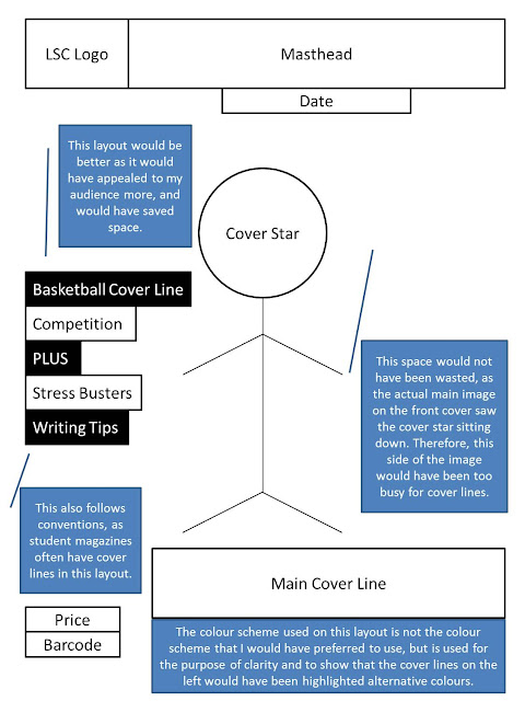
Another thing that I think did not go so well on the front cover was the layout of the cover lines around the cover star in the main image. The layout of the cover lines seems rather random, and this also contributed to the cover lines not being as easy to read as they should have been, as text colours did not stand out against the main image. It also means that, although the main cover line is bigger than the other cover lines, it is at the bottom of the front page, which makes it seem less important. Looking at the cover image again, I think I would have been able to have a list of cover lines to the side of the cover star. I think that this may have solved some of the problems that I was having with the cover lines. I think that it would be difficult to explain my ideal layout in words, so I have made an annotated diagram of my preferred layout:

 
To prevent this from happening in my main task, I think that I should plan my layout on the computer after I have taken my main image, so that I can work out where I want the cover lines, barcode, price, date and other features to appear on my front page.
 
Finally, I think that although the price is in bold, it is in black writing over a dark background, therefore is still easy to miss. I like the date where it is, but – to follow the colour scheme that I used – I think that the price should have been in yellow so it was more obvious how much the magazine was.
 
Contents Page
On the contents page, I decided that an article description should either end in a question mark, an exclamation mark, or nothing. I didn’t want my article descriptions to end in a full stop, and mostly I followed this theme. However, the article description of my cover story ended in a full stop, a punctuation mark added by habit. If I were to do this again, I would make sure that I checked all of the article descriptions before exporting the file to JPEG. This is also a problem that I had when doing my induction task; I also did not check my InDesign document before exporting it to JPEG, and had to re-export it so that my previous mistake was fixed. Therefore, I think that this is a matter that I need to take particular care with in my main task.
 
Also, I had no images on the contents page that reinforced what the cover story was; while the images were relevant to certain articles, there were no images for the cover story. This meant that I had to make the text for the cover story larger than the rest of the text, and the fact that there is no image takes away importance from the cover story.
 
Another problem with the contents page was that the two images that had writing over them i.e. the writing tips picture and the student column image were different sizes. While this didn’t really impact the aesthetics of the contents page, it affected the way the text fitted on top of the picture. On the student column image, the gap between the writing and the page number is bigger than the same gap on the writing tips picture, which I think makes it look unprofessional.
 
Audience Feedback
I received audience feedback via comments on my blog.
Front Cover
The styling of my front cover was simple and basic, and my main image was good for background use. My front cover also looked professional, stylish and modern.
 
I also received good feedback for the layout of my front cover; the styling is simple and basic, the layout was good, and the cover lines were spread out, which was surprising as I felt that my layout was one of the weaker parts of my front cover.
 
The text was not too big or too small, which made the cover lines easy to read, and my use of the colour scheme i.e. the ‘title’ cover line in one colour and the ‘description’ cover line in the other, made them stand out and therefore they were eye catching. My colour scheme also was “simple enough to keep the target audience interested”. This feedback makes me more glad that I changed the colour scheme from black, white and yellow to just white and yellow, as it makes it apparent that if I had kept the original colour scheme, not only would it have made certain cover lines hard to read against the light background, it would not have appealed to my target audience as much.
 
Contents Page
It was “excellent” as it had the same colour scheme as the front cover – which was also referred to as “simple and not overwhelming” and helped the text stand out because there was yellow text on a black background – and everything was nicely laid out in chronological order. It was also good that I had pictures to “complement” my articles.
 
I received positive feedback for the layout of my contents page, as it made it look “like a real contents page”. This was because I split the sections (regulars, features etc.) which made it easier for the reader to find the articles that they wanted to read. Also, the fact that I had article descriptions was good because it helped the reader know what the article was about.
 
However, one person also said that my Editor’s Letter was too long, and in fact this actually caused problems while I was making my contents page, as it meant that I had to squash the contents in that column closer together than they are on the other side. However, I do not agree that the Editor’s Letter was too long, even though the first draft of it may have been. Therefore, I think that I should still pay attention to the length of my Editor’s Letter, but I don’t think that it should be shorter than it was in my Preliminary Task.
 
I am surprised at the amount of good feedback I received. Doing the ‘what went well’ part of this evaluation was the hardest part of the evaluation for me, because I struggled to find anything that was good about my Preliminary Task.

Targets

  • Check InDesign work before exporting it to JPEG
  • Keep Editor's Letter precise and short
  • Take care over colour scheme

Friday, 26 October 2012

House Styles

For this task, I had to create a proposal for my magazine, a design for my layout, and a design for each component of my magazine that I was going to create: a front cover, a contents page, and a DPS.

Proposal

Ps23 is a CCM magazine - Contemporary Christian Music - focusing mainly on rock pop and some heavier rock. We hope to include artists from both sides of the Atlantic, from American hard rock bands such as Casting Crowns to British folk-rock bands such as The Rend Collective Experiment, and propose regulars such as reviews of albums and singles, annual reviews of CCM festivals such as Soul Survivor & Momentum and Big Church Day Out, and interviews with new artists. It is also possible that there may be a regular section for those aspiring to be worship leaders themselves. Ps23 is unique as there is currently only one CCM magazine available in the UK, and even this is difficult to buy, therefore there is a gap in the market for this type of magazine.

The ideal target audience for Ps23 is Christians aged 16-30 living in the UK. Our audience will likely be those in E and D class (though some of our older readers may be in C2 class) and we aim to appeal to those with a taste for more contemporary music inspired by the Christian faith. The ideal publisher for Ps23 would be the Bauer Media Group, a publisher who already publishes two music magazines (Q and Kerrang!), both of which cover the genres that Ps23 will feature, in their secular form. We expect that Ps23 will be the Christian version of these magazines, and therefore feel that the Bauer Media Group would be the right publisher for the magazine.

Masthead Designs
Front Cover

I have decided that the main image on my front cover will not be from a studio shoot, but a location shoot, where the artist will be depicted among Creation. This will continue the theme of Christianity throughout the magazine and will also appeal to my target audience, as in my Preliminary Task I received positive feedback for having a location main image on my front cover.

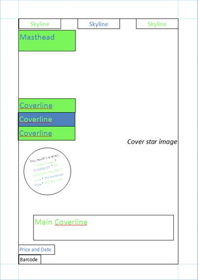
The colour scheme flows from the masthead, like it did in my Preliminary Task, and this layout fits the ideal layout of my front cover more as the coverlines are neatly placed together instead of randomly placed over the cover.

The front cover is also inspired by my Newsstand Task, as the left third contains the masthead and the minor coverlines, as well as the splash about the month's featured reviews, which compensates for the newsstand layout. In my Newsstand Task, I found that some newsstands are set up so that the top quarter of the magazine, not the left third, is the most important part of the magazine, as this is the part that the audience sees. Therefore I have used skylines to show some other articles within the magazine and have also placed the masthead in the top quarter as well as in the left third.

Contents Page

I have decided to make a double-page contents page for my main task instead of a single-page contents page, as in my Preliminary Task I had some trouble fitting everything on to one page, especially when I had written my Editor's Letter. Also, in my Case Studies Task, I found that Q had a double-page contents page; therefore it would not be so far from convention to use more than one page for the contents page.

In my Preliminary Task, I used rectangles on my contents page to separate the different categories, and I received positive feedback for doing so. Therefore, I decided to do it again. I have also taken inspiration from my Case Studies. Q magazine had a section for just the cover story with the regulars, and I have taken inspiration from this so as to fix a problem that I had in my Preliminary Task, which was that my cover story lost importance on the contents page by a lack of description and no image to complement it. These have a blue background with green writing, which is the colour scheme of the masthead reversed to continue the general colour scheme of the magazine, which is also what I did in my Preliminary Task. The font - Rockwell - is a clear font, and differs from the masthead so as to make the masthead unique. This font is the font that shall be used as the main text in the magazine as it will show how the house style flows from the category titles to the main body text.

DPS

The general layout of my DPS is inspired by NME, which I studied in my Case Studies Task. This can be seen because there is the image on one side, and the journalism on the other. Also, NME had a little profile of the artist in the corner of the page with the image, which I have also done. Finally, the position of the pull-quote was also in the middle of the column of journalism in NME.

I also took inspiration from Q for my DPS, as I have a short description of the interview (where it took place, etc.) before the Q&A style interview begins. Also, in Q magazine the date and masthead was repeated at the bottom of each page of the DPS. Here, I preferred to keep the masthead and date at the top of the page, but it is still inspired by Q.

Please fill in my questionnaire on these house styles to help with my audience feedback:

http://www.surveymonkey.com/s/887TVST

Wednesday, 24 October 2012

House Styles

I had a lesson today, and I have been preparing for my House Styles Pitch. My presentation was made on Prezi, and I used slides for my Proposal, Masthead Design, and the designs of my front cover, contents page and DPS. The actual Prezi only has the Proposal, Masthead Design and the pictures that I created of my layouts; I have written a script with prompts for when I give my actual presentation, so that the Prezi can be clear and uncluttered.

I have also been working on the hard copies of the House Styles that I will give in to my teacher. I have one page for my Masthead Designs:

One page for my Front Cover:

One page for my Contents Page:
One page for my DPS:

Monday, 22 October 2012

House Styles

Had another lesson today and have been working on my House Styles. As I am confident that I have completed my proposal and masthead design, I have been working on the layouts of my front cover, contents page and DPS for my magazine.
 As you can see, I have been working on my design for my front cover in this lesson. I worked on the features and articles that I wanted to include, and added these on the front cover. I also made the splash bigger so that it is easier to read, and I included how much the magazine will be and the date of the issue. I have also changed the font to the font that I will use in the magazine, Rockwell. This font will correspond with the mini-headlines that I designed for the contents page.
I have also added a bit more information about the main image. I have included that it will be set on location, among Creation, to go with the Christian theme of the magazine.
I have done a lot of work on my contents page this lesson. Before, the second 'photo for a regular' was a 'photo for a review'. However, I felt that this would be difficult to obtain as the photography has to be primary and the reviews are of real albums by real artists, so this photo would be a little unrealistic. Therefore, I changed it to a photo that would be easier to take.
Also, as I have worked out the articles that will be included in my magazine, I have written these in; the regulars and the features, and some of the reviews. They will not necessarily be in this order when I make the magazine parts, but they are there in the places where they are supposed to be.
I also did a lot of work on my DPS layout. Here, we can see where the photo will be and where the text will be. I took inspiration for the layout of the DPS from NME, as this also had the picture on one side with a little profile of the artist, and the journalism on the other. However, the placing of the pull-quote was inspired by Q.

Friday, 19 October 2012

House Styles

I had another lesson today, so I took some screenshots of what I've been doing. Basically, been working on the House Styles Task (Task 6), working on the design of my masthead and layouts for my front cover and contents page. Haven't gotten round to doing my DPS layout, but I think I'm gonna start that next lesson.
This is the masthead designs that I created. I started with the colour schemes that I wanted to choose from and then experimented with different fonts. Yesterday I posted a similar picture in which I had written commentaries for all of the colour schemes as for one of the fonts. Today, as you can see, I have added the commentaries for the two remaining fonts.
This is the layout for my front cover. This is the same as yesterday, again, but as you can see I have added a splash. You can't really see what it says in the splash in this picture, but it's for the reviews that will be included in the issue of the magazine. Also, I have added a rectangle showing where the cover image will go. However, this rectangle fits within the margins. For the final layout, I will change this so that the cover image covers the entire front page and is not just inside the margins; if I did it like this when I actually create the magazine front cover, there will be a white margin around the main image. Therefore, I have to change this next lesson.
These are the features that will appear on my contents page to separate the categories of articles (features, regulars, etc.) As you can see, I have already written a commentary explaining why I have made these and what they will be used for.
This is the layout for my contents page. I decided to do a double-page contents page as it was something that a classmate did for their Preliminary Task and I thought it was a good idea; for my Preliminary Task, I only had a single-page contents page, and this made it difficult to fit everything in. Also, when I did my Case Studies, Q magazine had a double-page contents page, and I thought that this looked really good. It also allowed for bigger writing and more pictures, which would appeal to the younger audience that my magazine is aimed at.

Thursday, 18 October 2012

House Styles and Newsstand Task

I had a lesson today, and I was continuing with my house styles. I made more possible mastheads, using the same colour schemes as before but experimenting with fonts. I made them on PowerPoint and wrote a few sentences about the colour schemes and about one font that I have used.

I also began working on my front cover house style, working on a possible layout using the blue and green colour scheme of three of my possible mastheads. It's similar to the ideal layout that I wanted for my Preliminary Task, which I posted in my Preliminary Task Evaluation.

After my lesson I did some more research into magazine distribution methods and finished typing up my findings for the second part of the Newsstand Task. I also transferred the first part of my Newsstand Task from Word to PowerPoint in order for it to fit on two pages instead of four. Also, I made some changes to the commentaries that I had written for the first part of the Newsstand Task, but only slightly.

Wednesday, 17 October 2012

Newsstand Task Part 2 (Diary Post)

I had a free lesson after my main lesson today, so I went to the Hub and typed up my current notes about magazine distribution methods. Our teacher had already explained to us about some magazine distribution methods on Monday's lesson, but not in much detail, leaving us to do the bulk of the research. However, I typed up the notes that I did have from that lesson and saved the document with the intention of adding my own research to it.

Newsstand Task Part 1

This task was in two parts - the first part was to analyse a newsstand, looking at how the magazines are displayed and how the publishers have designed the front covers of the magazines to compensate for the newsstand display.
The music magazines are in the 'men's lifestyle' section and are surrounded by magazines about various sports and technologies. We can see how the publishers have taken this into account by making the front covers with bolder text. The mastheads are big and loud, therefore suggesting that these magazines are geared more toward men.
 
In this newsstand, the magazines are placed on top of each other. This means that you can see the top quarter of the magazines but not necessarily the left third, as it is with other newsstand set-ups. In this picture, we can see how most publishers have anticipated this newsstand set-up by putting the masthead in the top quarter so you can see which magazine is which.
 
 
Here, we can see how the publishers have used the top quarter of the magazines to grab the reader's attention. We can already tell that the mastheads are seemingly always in the top quarter, but there  are also skylines in the top quarter - on Kerrang! there is the skyline about posters; on NME there is the offer for an exclusive CD; on Total Guitar there is the splash; and on Q there is the skyline for three articles, two of which have pictures.
 
We can also see in this picture how the publishers have also used the left third to compensate for other newsstand set-ups. On Kerrang! there is the splash advertising the competition to win tickets to a tour; on NME the masthead is in the left third, and as you can see in the picture below, the free gift mentioned in the top quarter appears in the left third; on Total Guitar the splash is also in the left third; and on Q the masthead is also in the left third.
 

Case Studies

The second task of this project was Case Studies. For this, we had to get two music magazines and analyse the front cover, the contents page, and a double page spread of each. We also had to look at the press packs and find out information about the audience and publisher of the magazines. At this stage of the project it was a good idea to know what genre of music you wanted your magazine to be, so that you could analyse existing magazines of that genre. However, as I wanted to do a CCM magazine, I have analysed Q and NME as more mainstream magazines that would appeal to my target audience age-wise, and have also analysed two CCM magazines in less detail, Worship Musician and Christian Musician, to learn the conventions of Christian magazines. However, the audiences of these magazines are older than the audience for my magazine would be, therefore they are less likely to affect the decisions that I make for my Main Task.

Q


NME
 
Worship Musician


Christian Musician