I had another lesson today, so I took some screenshots of what I've been doing. Basically, been working on the House Styles Task (Task 6), working on the design of my masthead and layouts for my front cover and contents page. Haven't gotten round to doing my DPS layout, but I think I'm gonna start that next lesson.
This is the masthead designs that I created. I started with the colour schemes that I wanted to choose from and then experimented with different fonts. Yesterday I posted a similar picture in which I had written commentaries for all of the colour schemes as for one of the fonts. Today, as you can see, I have added the commentaries for the two remaining fonts.
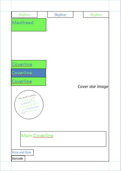
This is the layout for my front cover. This is the same as yesterday, again, but as you can see I have added a splash. You can't really see what it says in the splash in this picture, but it's for the reviews that will be included in the issue of the magazine. Also, I have added a rectangle showing where the cover image will go. However, this rectangle fits within the margins. For the final layout, I will change this so that the cover image covers the entire front page and is not just inside the margins; if I did it like this when I actually create the magazine front cover, there will be a white margin around the main image. Therefore, I have to change this next lesson.
These are the features that will appear on my contents page to separate the categories of articles (features, regulars, etc.) As you can see, I have already written a commentary explaining why I have made these and what they will be used for.
This is the layout for my contents page. I decided to do a double-page contents page as it was something that a classmate did for their Preliminary Task and I thought it was a good idea; for my Preliminary Task, I only had a single-page contents page, and this made it difficult to fit everything in. Also, when I did my Case Studies, Q magazine had a double-page contents page, and I thought that this looked really good. It also allowed for bigger writing and more pictures, which would appeal to the younger audience that my magazine is aimed at.


No comments:
Post a Comment